Visualizing Statistics With Dynamic Ranges
by Steve Marx on
I built paschoolstats.com a couple weeks ago to help keep track of important COVID-19 statistics in Pennsylvania counties. While designing the site, I encountered an interesting visualization challenge.
Visualizing relationships
The purpose of the site is to make it easy for everyone to see whether there is “low”, “moderate”, or “severe” community transmission in their county. These designations are used by the Pennsylvania Department of Education, and each is associated with guidance for local schools on what sort of education model to offer.
I also wanted to make sure people understood the actual data behind those designations and a bit of context. Fortunately, the designations are based on just two numbers.1 For each, I wanted to show how the number was changing and where the number fit within the three ranges (low, moderate, and substantial).
How to visualize ranges?
My first attempt was a line chart with horizontal lines delineating the different ranges, but it turned out that the data I had access to only provided the two most recent datapoints. That makes for a lame chart.
An additional challenge is the ranges themselves. For example, the test positivity rate uses the following ranges: <5% is low, 5% to <10% is moderate, and 10% to 100% is substantial. If you use a linear scale from 0% to 100%, it can be really hard to see the significant threshold at 5%.
Displaying dynamic ranges
Below is a live demo of my solution. For demo purposes, the value changes randomly every two seconds. Note that the colored ranges shrink and stretch to accommodate the value:
By default, the three bars are the same width, with green representing 0-24, yellow representing 25-49, and red representing 50-74. But values can be up to 99, so the proportions sometimes need to be adjusted.
The solution is quite simple. If the value exceeds the displayed range, expand the last range to accommodate the value and shrink the whole group to fit.
Implementation
For paschoolstats.com, I did actual math to size each of the bars, but when putting together this blog post, I realized I could make the browser do the work by using the flexbox layout model. It starts with a flex container, with three bars inside:
<style>
div.bar {
    position: relative;
    display: flex;
    width: 100%;
    height: 5px;
}
</style>

<div class="container">
    <p id="value"></p>
    <div class="bar">
        <span id="pointer"></span>
        <div class="green"></div>
        <div class="yellow"></div>
        <div class="red"></div>
    </div>
</div>
The update() function adjusts the ranges and puts the size of each into the corresponding bar’s flex-grow styles:
const initialRanges = [25, 25, 25];
const initialTotal = initialRanges.reduce((a, b) => a + b, 0);

function update() {
    var v = Math.floor(Math.random() * 100);
    value.innerText = v;

    // ranges each segment will cover
    var ranges = initialRanges.slice();
    var total = initialTotal;

    value.className =
        v >= ranges[0] + ranges[1] ? "red" :
        v >= ranges[0] ? "yellow" :
        "green";

    // if the value exceeds the total
    if (v > total) {
        // expand the last range to cover
        ranges[2] += v - total;
        total = v;
    }

    // size the segments
    for (var i = 0; i < ranges.length; i++) {
        segments[i].style.flexGrow = ranges[i];
    }

    pointer.style.left = Math.round(v/total * 100) + "%";
}
Finishing touches
On the website, I also added the previous week’s value and an arrow indicating the direction of change. I’m pretty happy with the result.
Here’s the finished design:
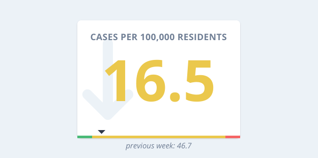
screenshot from paschoolstats.com
-
The numbers are the per-capita new cases and the test positivity rate, both for the most recent 7-day period. ↩︎